
Hero – Home
The ‘Hero – Home’ component is an interactive element meant to be used on property home pages.
View Component

The ‘Hero – Home’ component is an interactive element meant to be used on property home pages.
View Component
The ‘Hero – Text’ component is a very simple hero used only to display text.
View Component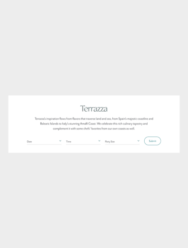
The ‘Hero – Resy’ component will be used on dining pages and pull in a reservation widget from Resy.
View Component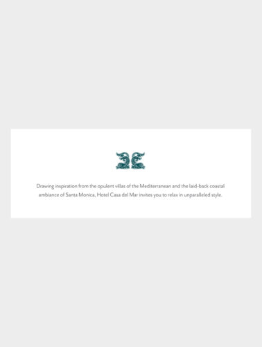
The ‘Intro’ component is meant to introduce a section of content.
View Component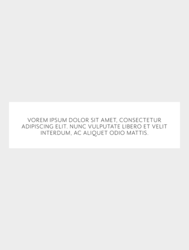
The ‘Large Intro’ component is meant to introduce a section of content at a larger scale.
View Component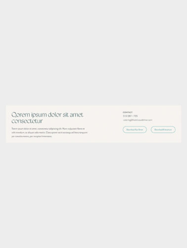
The ‘Contact Intro’ component that can either be used as a banner or right below the banner. It will introduce the content on the page and/or display contact information.
View Component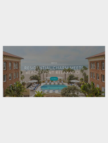
The ‘Callout’ component is meant to introduce prominent content.
View Component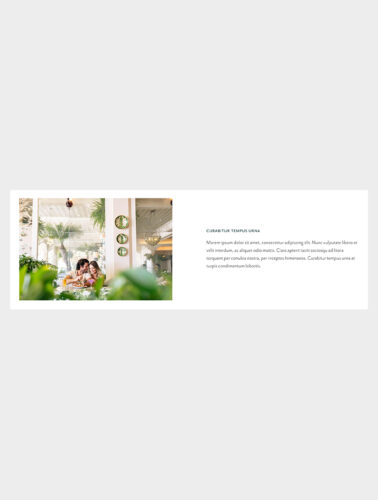
The ‘Text + Image’ component is used to display text with one image.
View Component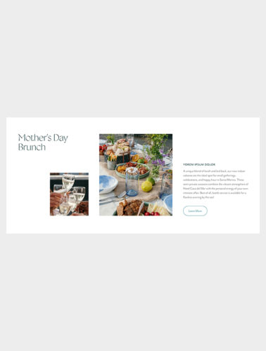
The ‘Text Two Images’ component is used to display text with two images.
View Component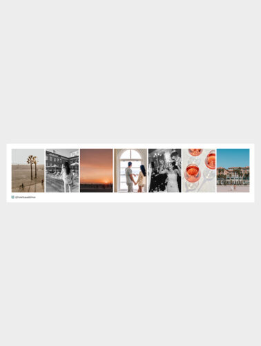
The ‘Instagram Feed’ component is a plugin that pulls in an Instagram handle’s feed.
View Component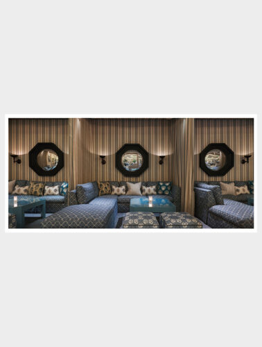
The ‘Full Screen Media’ component is used to display a full-width image or video.
View Component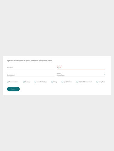
The ‘Form’ component is meant to collect a user’s data.
View Component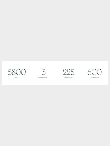
The ‘Statistics’ component is used to highlight specific venue statistic values.
View Component
The ‘Fixed Vertical Scroll’ component hijacks a user’s scroll experience to force them to view multiple pieces of content in a row.
View Component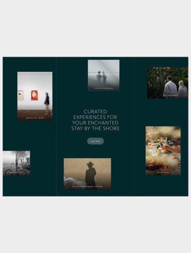
The ‘Editorial Grid’ is an interactive component used for a prominent call-to-action. It displays several editorial images with a parallax effect.
View Component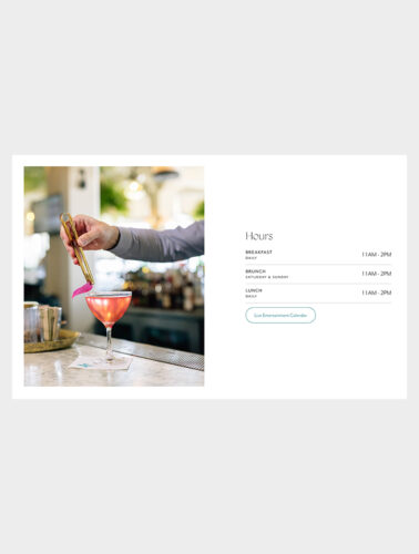
The ‘Hours’ component is meant to display hours for restaurants and spas.
View Component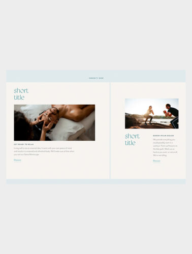
The ‘Offset Cards’ component contains a 2-card and/or 3-card variation, where content editors can use to display manual content.
View Component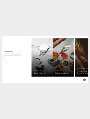
The ‘Slider’ is a horizontal scrolling component that is meant to display offers. Can pull from syndicated post types or build cards manually.
View Component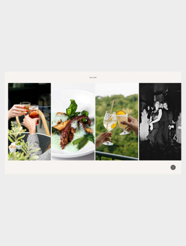
The ‘Image Slider’ component is used to display an image gallery.
View Component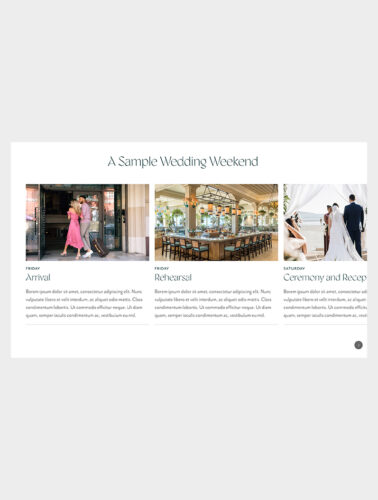
The ‘Text Card Slider’ is a horizontal scrolling component that can display a wide variety of content. Content admins will manually input the image, text and links for each card.
View Component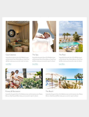
The ‘Card Grid’ is a flexible component that can display between 2-9 cards.
View Component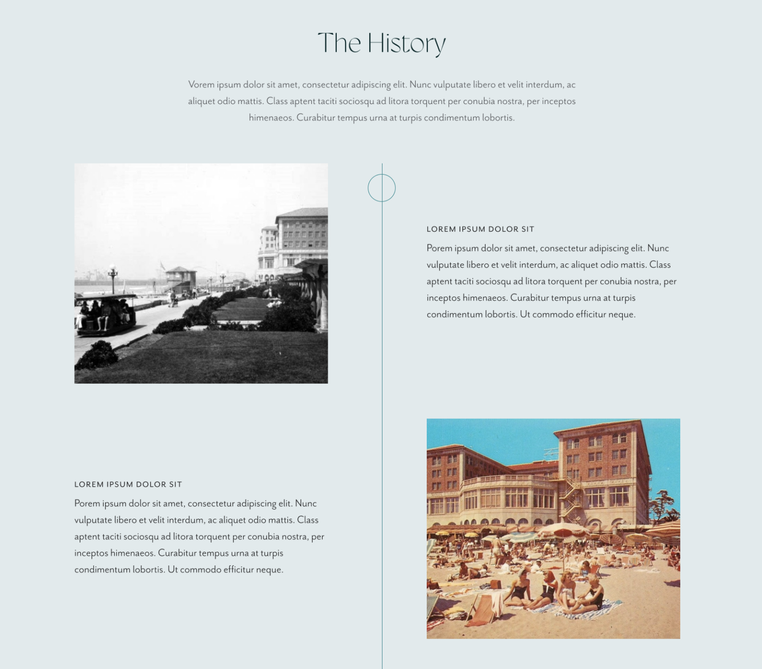
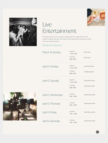
The ‘Calendar’ component will be updated regularly to display ETC’s entertainment calendar. Content editors can update the title, description, link at the top, and images at the component level. The list will pull from the Calendar Entry post type. It will display the next 7 days.
View Component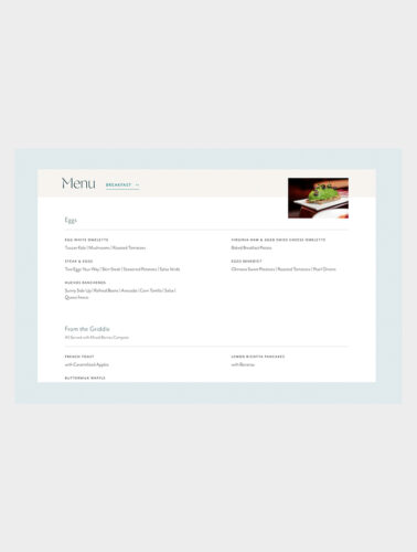
The ‘Menu’ component will reference the custom ‘Menu’ post type. Content admins can reference menus that will display in tabs across the top.
View Component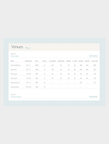
The ‘Venues’ component pulls in venues from the Venues post type. By default, it will display all venues. Users can use the dropdown to navigate between any venue.
View Component
The ‘Offers’ component allows content admins to place a single, syndicated offer on a page.
View Component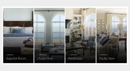
The ‘Accommodations’ component allows content admins select rooms or suites to display. The teaser image, accommodation name and link will be syndicated from the individual accommodation page.
View Component